
Pt. 14 – single tones
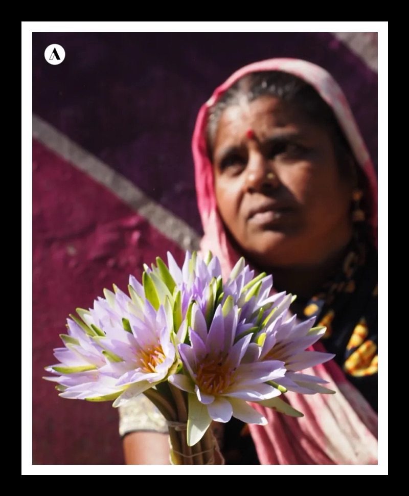
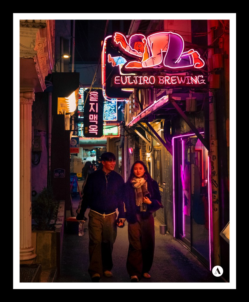
Fotos, die in der gleichen Farbfamilie gehalten sind, sind keineswegs langweilig. Sie können durchaus abwechslungsreich und interessant sein.
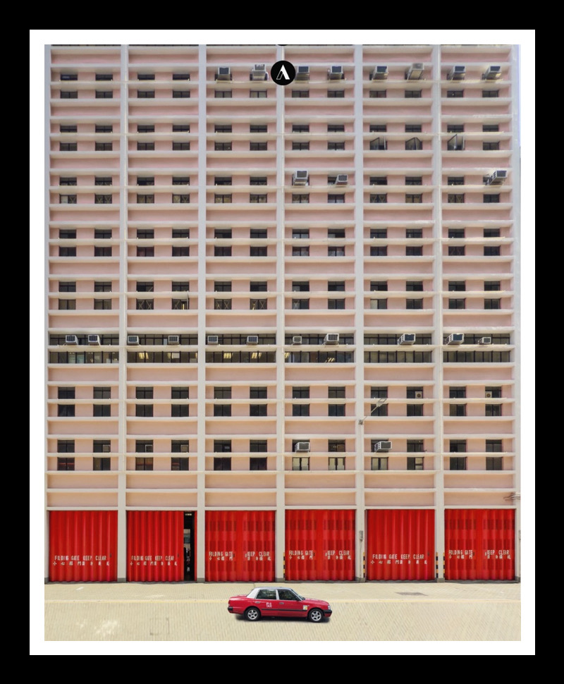
Im Idealfall variieren die Nuancen der Farbe. Dies ergibt ein ruhiges Bild, welches durch die unterschiedlichen Töne interessant und abwechslungsreich wird.
Manchmal sind solche Orte ganz offensichtlich, in Los Angeles gibt es zum Beispiel eine pinkfarbene Wand, wo man ganz gezielt Fotos mit Kleidung in pink aufnehmen kann. Ich persönlich finde aber die Fotos besser, die man zufällig macht, weil einem die Szene aufgefallen ist. Es hat für mich etwas mit Achtsamkeit zu tun, mit der Art des Sehens.
Deshalb kann ich immer nur empfehlen, zu Fuß zu gehen und sich langsam zu bewegen und aufmerksam zu sein.
Die Fotos sind entstanden in:
1 Mumbai, Indien
2 Hong Kong
3 Bergen, Norwegen
4 Hyderabad, Indien
5 Seoul, Südkorea
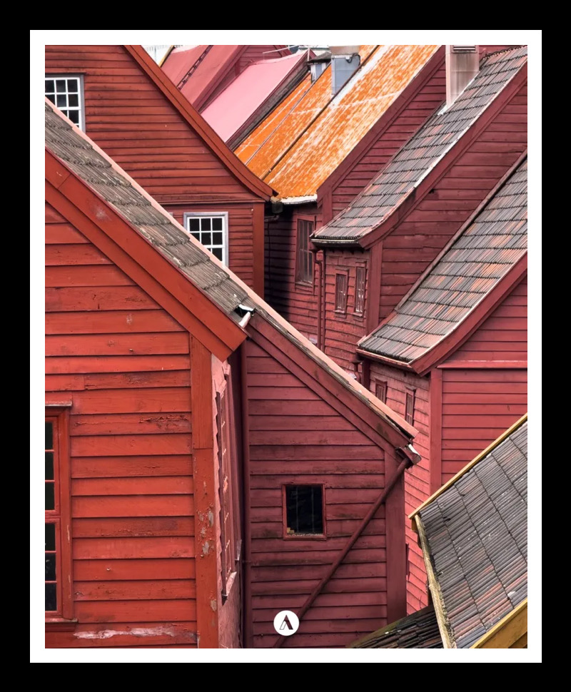
Photos that share the same color family are by no means boring. They can certainly be varied and interesting.
Ideally, the shades of the color vary. This creates a tranquil visual effect that is made interesting and varied by the differing tones.
Sometimes such places are quite obvious; in Los Angeles, for example, there is a pink wall where you can specifically take photos while wearing pink clothing. Personally, however, I prefer the photos taken spontaneously because a scene caught my eye. For me, it has to do with mindfulness—with the way one sees things.
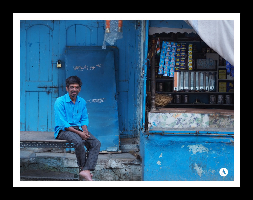
That is why I always recommend walking around, moving slowly, and being attentive.
The photos were taken in:
1 Mumbai, India
2 Hong Kong
3 Bergen, Norway
4 Hyderabad, India
5 Seoul, South Korea

 www.khun-aleks.de