
Pt. 12 – Letters
Schriften und Buchstaben finden wir überall: als Informationen, in Werbung oder als Namen. Oft scheinen sie nicht geeignet für Fotos zu sein, aber richtig in Szene gesetzt können die Bilder toll aussehen und mehr vermitteln, als nur die Schrift.
Ich finde es immer toll, wenn die Schrift gut zu erkennen und gut lesbar ist und zeitgleich weitere Informationen übermittelt werden: zum Beispiel wie es dort ausschaut, was die Location ausmacht oder warum die Schrift überhaupt dort angebracht wurde.
Besonders wichtig finde ich, dass die Schrift gerade ist – genauso wie der Horizont bei Landschaftsaufnahmen gerade sein sollte. Zudem sollte die Schärfe auf der Schrift liegen.
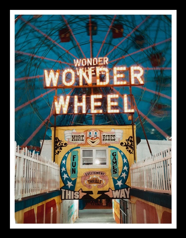
Das erste Foto wurde auf Coney Island aufgenommen und zeigt vielleicht das bekannteste Riesenrad der USA – das Wonder Wheel. Zum Einen zeigt das Foto natürlich das Riesenrad selbst, aber es vermittelt auch die Informationen, dass es mehrere Fahrgeschäfte und Attraktionen gibt und nicht alleine – wie zum Beispiel das London Eye – dort steht. Überhaupt ist Coney Island ein toller Ort zum Fotografieren: alte Karusells ab 1920 gebaut, Essensstände und im Sommer die Strände New Yorks mit vielen Menschen eigenen sich perfekt für Street Photography.
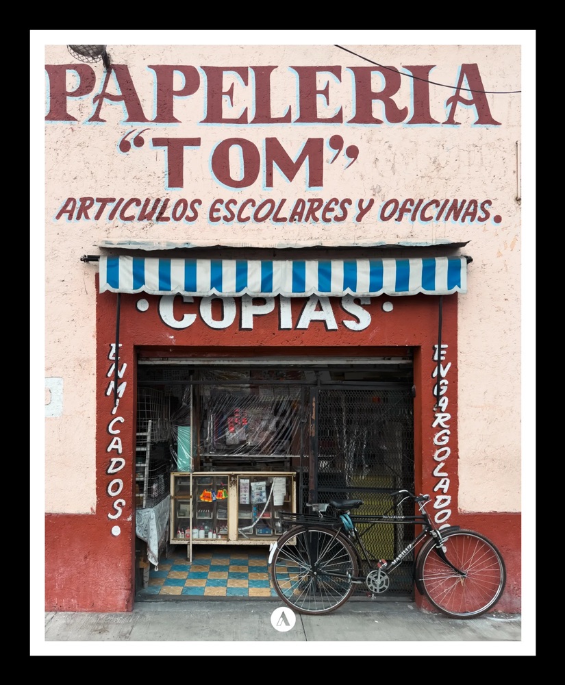
Das zweite Foto zeigt ein Schreibwarengeschäft in México City. Sicherlich ist dies kein klassisches Urlaubsfoto, aber die Farben und das davor abgestellte Fahrrad ergeben ein dokumentarisches Foto des alltäglichen Lebens, das ich ohne die Schrift sicherlich nicht aufgenommen hätte.
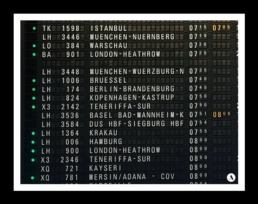
Das nächste Foto zeigt die historische Abflugstafel des Frankfurter Flughafen. Wo heutzutage moderne Monitore die Flüge auflisten, findet sich hier noch eine alte Tafel mit Fallblättern.
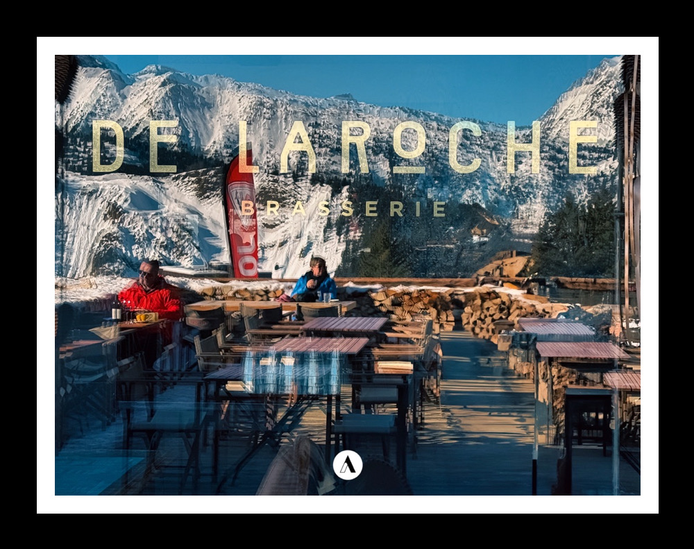
Das nächste Foto zeigt ein Restaurant in den französischen Alpen. Durch die Spiegelung ist die Umgebung unscharf, aber deutlich genug zu erkennen.
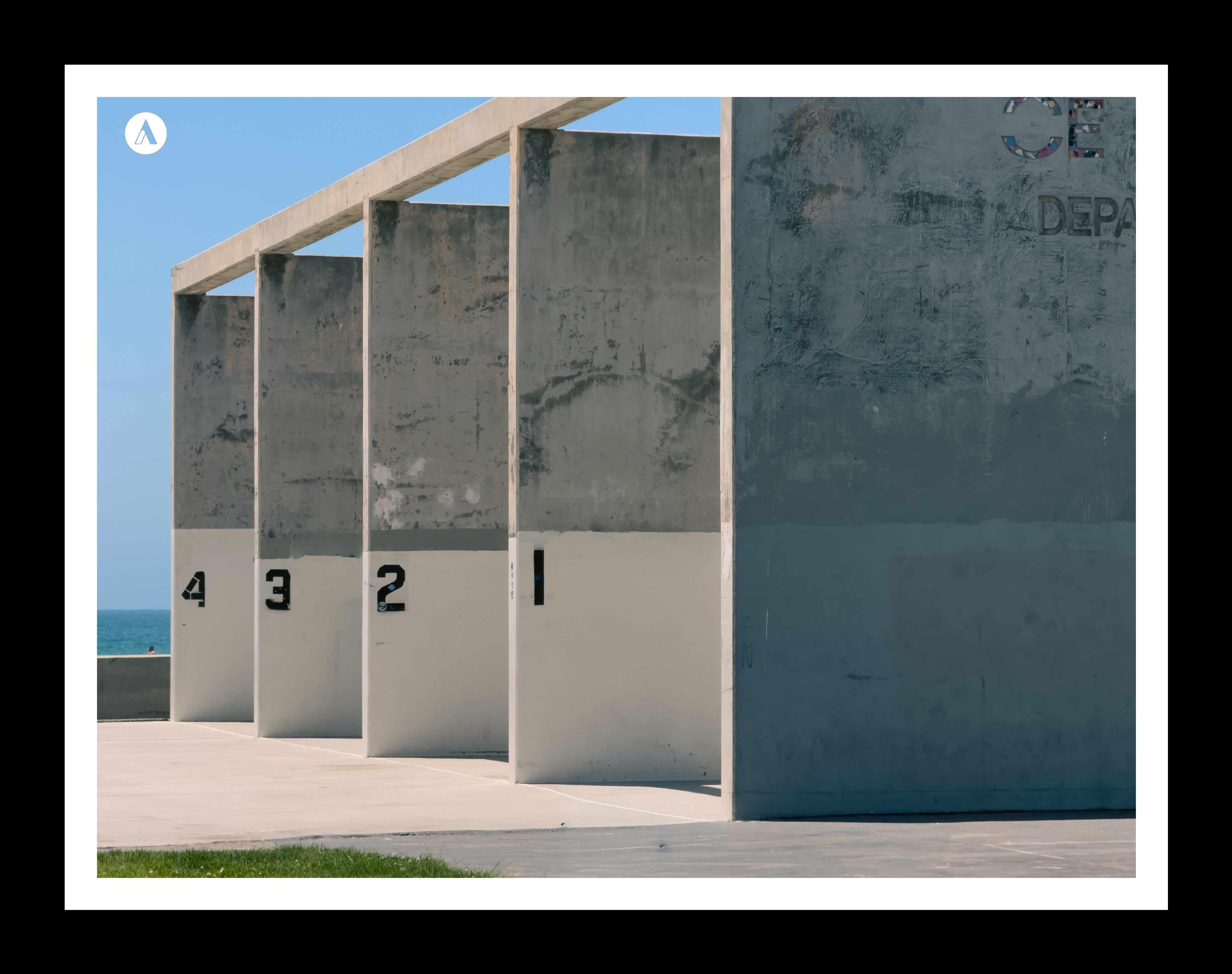
Dies sind nur einige Beispiele zur Inspiration, wie Schriften in unsere Fotos eingebaut werden können. Auch einzelne Buchstsaben oder Zahlen eigenen sich toll, wie zum Beispiel die Schilder der Züge der New Yorker U-Bahnen, große Logos von Fastfood Restaurants oder Nummerierungen wie auf dem letzten Foto von Venice Beach in Los Angeles.
We encounter type and lettering everywhere – as information, in advertising, or as names. They often seem unsuitable for photographs, but when staged effectively, the resulting images can look fantastic and convey much more than just the text itself.
I always love it when the lettering is clearly visible and easy to read, while delivering additional information, too – such as what the place looks like, what makes the location special, or why the lettering was placed there in the first place.
I find it particularly important that the text is straight – just as the horizon should be straight in landscape shots. Furthermore, the focus should be on the text.
The first photo was taken at Coney Island and shows perhaps the most famous Ferris wheel in the USA – the Wonder Wheel. While the image naturally features the Ferris wheel itself, it also conveys the fact that there are numerous rides and attractions there, rather than it standing in isolation – unlike the London Eye, for instance. Coney Island is a fantastic place for photography in general: vintage carousels dating back to the 1920s, food stalls, and – in the summer – New York’s crowded beaches all provide perfect settings for street photography.
The second photo shows a stationery store in Mexico City. It is certainly not a classic holiday snapshot, but the colors and the bicycle parked out front create a documentary-style image of everyday life – one I certainly wouldn’t have taken without the lettering.
The next photo shows the historic departure board at Frankfurt Airport. Where modern monitors list flights today, an old board with split-flap displays can still be found here.
The next photo shows a restaurant in the French Alps. Due to the reflection, the surroundings are blurred but distinct enough to be recognized.
These are just a few examples to inspire you regarding how lettering can be incorporated into our photos. Individual letters or numbers work beautifully, too – such as New York subway train signs, large fast-food restaurant logos, or the numbers seen in the final photo from Venice Beach, Los Angeles.

 www.khun-aleks.de